If you’ve ever felt buried under expense tracking apps but craved an effective visual that makes your entire year’s cash flow easy to read with a Sankey diagrams this is for you. Today I’m sharing my exact journey from exporting a Kakeibo database to generating a publication-ready Sankey diagram using Docker, SQLite, Python, and Plotly.
The Spark: That Reddit Sankey Epiphany
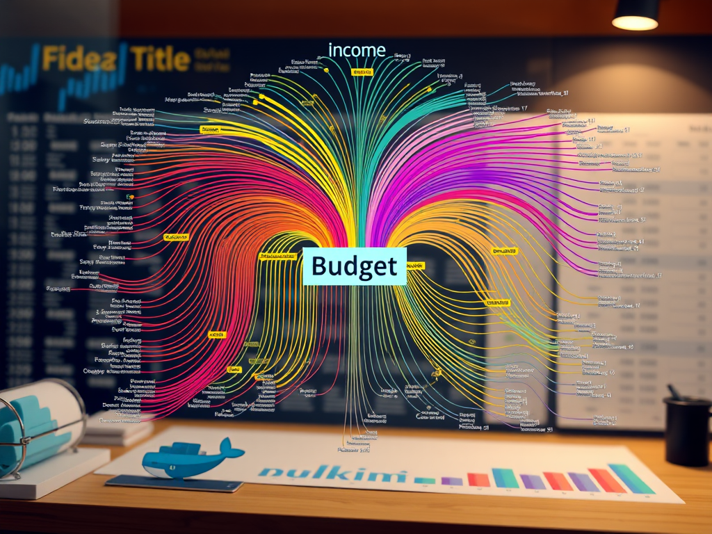
Scrolling Reddit last December, I stumbled upon a post titled “Our 2025 Year – Family Finances.” The attached Sankey diagram was pure gold: income streams converging into a central “budget” node, then exploding into expenses. It wasn’t just pretty, it told a story of personal finance!!!! At a glance, you saw allocation efficiency, waste spots, and savings triumphs.
Sankey diagrams emphasize the major transfers or flows within a system. They help locate the most important contributions to a flow, regardless we are talking about a flow of energy, of water or…. a flow of money in my family
https://en.wikipedia.org/wiki/Sankey_diagram
My Kakeibo app (Japanese budgeting method, Android-based) had been logging transactions for the whole year. But I was lacking a clear way to visualize all of those figures. Time to liberate those numbers…..
Step 1: Kakeibo Export → SQLite Docker Rescue
Kakeibo backups are ZIPs containing kakebo.db, kakebo.db-shm, and kakebo.db-wal Extracted to a folder, I fired up Docker for analysis:
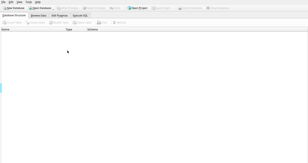
docker run -d --name sqlitebrowser --security-opt seccomp:unconfined \ -e PUID=1000 -e PGID=1000 -e TZ=Europe/Zurich \ -p 3000:3000 -p 3001:3001 -v ./kakebo:/config \ --restart unless-stopped lscr.io/linuxserver/sqlitebrowser:latestThe above gave me a web-based UI for sqllite, it was then able to load the exported files into database tables
below a log snippet
Browser to localhost:3000, open /config/kakebo.db. Tables: Transactions, Categories. Key columns: timestamp, amount, categoryId, subcategoryId, notes, type (1=income, 2=expense).First query for 2025 outflows
SELECT c1.name AS source, COALESCE(m.notes, c2.name) AS target, SUM(m.amount1) AS valueFROM Transactions mJOIN Category c1 ON m.categoryId = c1.idLEFT JOIN Category c2 ON m.subcategoryId = c2.idWHERE m.Timestamp >= 1735689600000 AND m.Timestamp < 1893456000000 AND m.type = 2 -- Expenses onlyGROUP BY c1.name, COALESCE(m.notes, c2.name);Exported to input.csv. Raw data ready, but needed transformation for proper Sankey structure:
incomes left → “Budget 2025” center → expenses right.
Sankey data structure is composed by three fields: source (where this transaction is coming from, example: salary) target (where this transaction is flowing, exampe: budget 25) and the amount (1 Million)
Data should be then harmonized like this
Step 2: Vibecoding the Data Pipeline
Here’s where antigravity (my AI assistant) shone. I fed it specs.md: precise 4-step logic to reshape CSV into Sankey format (source,target,value).
Core specs
- For income rows:
source=note, target=name, value=amount - Aggregate step 1 →
source=target (income cats), target="Budget 2025", value=sum - For expense rows:
source=name, target=note, value=amount - Aggregate step 3 →
source="Budget 2025", target=source (expense cats), value=sum
Antigravity generated gensankey.py using pandas—pure gold:
import pandas as pd

df = pd.read_csv('input.csv')

# Step 1-2: Incomes → Budget
..........
income_agg['source'] = income_agg['target']
income_agg['target'] = 'Budget 2025'

# Step 3-4: Expenses → Budget reverse
...........
expense_agg['source'] = 'Budget 2025'
expense_agg['target'] = expense_agg['source']

# Combine all
sankey_df = pd.concat([income_links, income_agg, expense_links, expense_agg])
sankey_df.to_csv('output.csv', index=False)
Dockerfile updated:
FROM python:3
WORKDIR /usr/src/app
RUN pip install pandas plotly
COPY gensankey.py .
CMD ["python", "gensankey.py"]
Build and run: docker build -t sankey-gen . && docker run -v $(pwd):/usr/src/app sankey-gen. Boom—output.csv ready for visualization.
Step 3: Plotly Sankey – From Ugly to Stunning
Initial Plotly attempts? Disaster. Default layouts mangled flows, nodes overlapped, no custom colors. Antigravity iterated via walkthrough.md:
Key fixes from debugging:
- Strict 5-layer positioning: x=[0,0.25,0.5,0.75,1] forced Income Details → Cats → Budget → Expense Cats → Details.
- Dynamic heights: Calculated via cumulative sums to prevent overlaps.
- Custom node colors: Mapped from YAML dict to
node.color.
Final displaydata.py snippet:
pythonimport plotly.graph_objects as go
df = pd.read_csv('output.csv')

# Unique nodes and positions
all_nodes = list(set(df['source'].tolist() + df['target'].tolist()))
node_dict = {node: i for i, node in enumerate(all_nodes)}
colors = {'Budget 2025': '#FF9800', 'Stipendi': '#2196F3', 'Affitto': '#F44336'}  # etc.

fig = go.Figure(go.Sankey(
    .............
Why This Workflow Wins
- Zero vendor lock-in: Kakeibo → SQLite → CSV → portable Sankey.
- Docker reproducibility: One command rebuilds anywhere
- AI-assisted vibecoding: Specs.md → working code in iterations.
- Scalable: Add
colors.yaml, CLI args for multi-year, categories.
Total time: 4 hours debugging → lifelong template.
Files for you:
- Dockerfile
- gensankey.py
- displaydata.py
- Sample input.csv
What’s your cash flow story? Drop in comments.
Vibeops.one: DevOps experiments for side hustlers. Follow for more

Leave a comment